Cracker Barrel Unveils New Logo Amid Brand Transformation

Introduction
The recent change in Cracker Barrel’s logo marks a significant step for the beloved American restaurant and retail chain. Known for its Southern comfort food and nostalgic atmosphere, Cracker Barrel has been a staple since its inception in 1969. The logo change is not just a cosmetic update; it reflects the brand’s commitment to evolving while staying true to its values. This transformation comes at a time when brand identity has become increasingly important in the fast-casual dining industry, especially amidst changing consumer preferences.
The New Logo Design
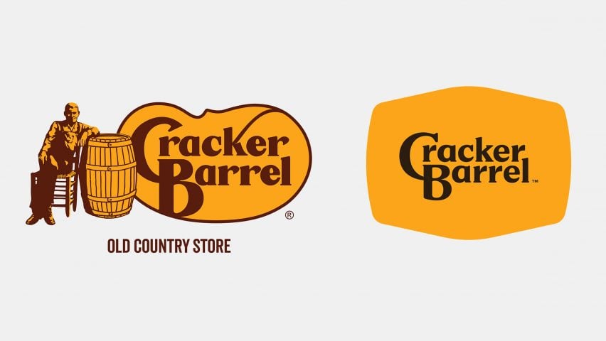
Unveiled earlier this month, the new Cracker Barrel logo features a more modern font and a sleeker overall design, simplifying the previous look that some critics regarded as outdated. The familiar orange hue remains, preserving the brand’s heritage, but it is complemented by a new artistic flair that aims to appeal to a younger demographic without alienating loyal customers.
Marketing experts suggest that the change is a strategic move to refresh Cracker Barrel’s appeal to millennials and Gen Z customers, who favor brands that reflect contemporary design sensibilities. By updating its logo, Cracker Barrel seeks to align itself with current trends while keeping the essence of its beloved Southern roots intact.
Customer Reactions and Brand Impact
Customer reactions have been mixed following the new logo reveal. Many loyal patrons appreciate the nod to modernization, while others express nostalgia for the previous design. This type of brand evolution is often met with resistance, particularly from long-time customers who feel a connection to the original logo. However, marketing analysts believe that this change may ultimately enhance the restaurant’s visibility and strengthen its brand identity in a competitive marketplace.
The logo change is part of a broader initiative by Cracker Barrel to revamp its image. Alongside the logo, the company is also updating its menu and store layouts to enhance customer experience. These changes come at a pivotal moment as the restaurant industry continues to recover from the impacts of the COVID-19 pandemic.
Conclusion
As Cracker Barrel embarks on this journey of transformation, the logo change serves as a symbol of both continuity and evolution. While it may take time for some customers to fully embrace the new branding, the overall direction points towards a modernized identity that aims to attract a diverse clientele. The coming months will reveal how effective this brand rejuvenation strategy is in maintaining loyalty while gaining new customers. For Cracker Barrel, the logo change is more than just aesthetics; it represents a thoughtful approach to adapt and thrive in a rapidly changing dining landscape.


